Here we go after you got that software in your laptop or pc...hehe^^ lets get it started:
1) Firstly, I created a new file with the following set-up:
- width 297mm
- length 210mm
- 300 pixels for the resolution
2)Then, I created a background by using gradient tool (combination of blue and black)

3) Next, I selected a portion from the first image that I was going to used, by using quick selection tool followed by the masking techniques for a very clean selection.

The above was the example of entering a quick mask mode...by pressing Q

After you had editted the portion that I wanted, I lef the quick mask mode by clicking on Q again..T his time you would see any of the selected areas which would be my selection.

This was the portion that I wanted.. I only wanted this part for my first calendar background.
4) Next, I placed another image into the photoshop.

5) From this image, I would select the grassy part to be the forest for my first calendar design. Once again I made the selection using quick selection tool,then creating quick mask and made the selection..


6) Later, I pasted the above selected area into the calendar design artboard as shown below:

7) Well, I believed some of you may wonder why there was a light ray there on the background.. Good question!! It was indeed one of the filter effects that I had applyied. That was the filter effect of lens flare which fell under the category of render.


8) Next, I made another copy of selection from the previous image to be the right portion of forest in my overall design of the first calendar.

Once again, I applied the quick mask technique for a clean selection.
oh yea!!this was the part that I wanted to be the second forest design.

It was as shown above of what I wished to create by using the forest layers.
9) However the forest layers did not really blend well in overall view, so I decided to edit the color of those layers. First I clicked Image, then clicked on the adjustments option, and there was an option known as hue/saturation.


10) After editted the hue/ saturation, you will definitely see the changes of colors for the layers of forest 1 and 2,as shown below:

11) Then I opened another image again to select the flying bird that I wanted.


12) Once again, I would paste the selected area to the calendar design..

(noted that the color changed? This wass because I applied hue/saturation once again to make the flying bird to be in a bit purple color)
13) Next, I created a bright star using the brush that I downloaded from Qbrushes...I applied the effect of outer glow and color overlay for this star to make it more attractive.

The above showed the option of outer glow.

14) Next, I added another more flying bird on the sky and of course I applied the adjustments of hue and saturation...

15) From the above picture, it was obviously seen that there were some empty spaces so decided to place the flower to overlap them..


16) Then, once again I played with hue/saturation to make the flower color more towards purple or pink which quite similar to the background color.

17) In order to make the whole design more fantasy, I added in a pretty angel from other picture as well...


For sure, I did modify the setting of hue/saturation to make the angel to blend into the overall design.
18) I flipped the image of the above angel towards the other side...


19) Once again, I applied the hue/saturation for the second time for this angel layer due to I wanted the color to become more towards purple red.

20) The sky seemed to be quite empty without the apperance of bright stars so I decided to design some stars on the sky background. (once again I was using the brushes from Qbrushes)

this is only the first layer of stars...
21) I applied the Gaussian blur effect and outer glow to produce the above stars and of course I used brush tool to draw to stars...


22) I duplicated the layer of the stars and what made this layer so important was that the blending mode of this layer I somehow changed to overlay..


23) Last but not least, it was essential to insert the numbers for particular month..My calendar is to design for the month of march,therefore I inserted all the dates of march of 2011...

Since the original file was in illustrator, I would have to drag the file to photoshop in order to use it..

In order to make the dates of the month more interesting, I applied the folowing effects:

This was outer glow effect and it was used for making the overall numbers and label more outstanding.

This was bevel and emboss..However, this situation, I preferred emboss and I would like to have above settings to make my wordings have 3dimensional feeling.

Lastly, it was color overlay to make the overall typography more easily to be read and seen.
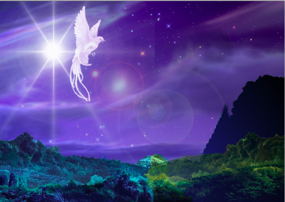
FInal artwork of first calendar:

No comments:
Post a Comment